Unsupervised Image Classification with QGIS
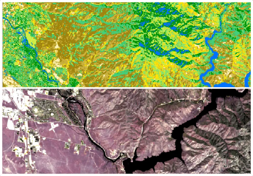
Image classification is the process of using numerical methods to automate the identification of objects in images and is a common method to interpret satellite imagery. With vast amounts of satellite imagery being collected every day it is next to impossible to manually classify satellite images for their many purposes. Instead we rely on numerical and statistical methods to do the classifiation for us.
There are two general methods used for image classification: supervised classification and unsupervised classification. Supervised classification uses observations or labels to train models (statistical or artificial intelligence/machine learning) to recognize what different features (land cover types, etc.) look like in satellite images, then make a classification for each pixel, or object in an image.
Unsupervised classification assigns satellite image pixels, or objects, to a group based on their similarity to other pixels. Unsupervised classification is an automated approach that doesn’t require any training data. The downside to this approach is that image classes are based purely on pixel similarities and may not have realistic interpretations.
This article demonstrates how to perform unsupervised classification with a Landsat 9 image in QGIS using the K-Means algorithm.
Download a Satellite Image
To start, you’ll need to download a satellite image. Here, I’m using an image from Landsat 9. For directions on how to download imagery from satellite platforms (including Landsat 9 and Sentinel-2) for free, see this article.
Create a Virtual Raster
Once you have downloaded a satellite image, import the appropriate bands to QGIS. For Landsat 9, I recommend you import band numbers 1-7.
Initially, your bands will show up in the table of contents and individual layers. This makes it a little difficult to visualize them with band combinations. To address this, let’s create a virtual raster. A virtual raster will create a stack of multiple bands, making it easier to visualize band combinations.
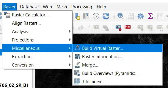
To create a virtual raster select Raster > Miscellaneous > Build Virtual Raster from the QGIS main menu.
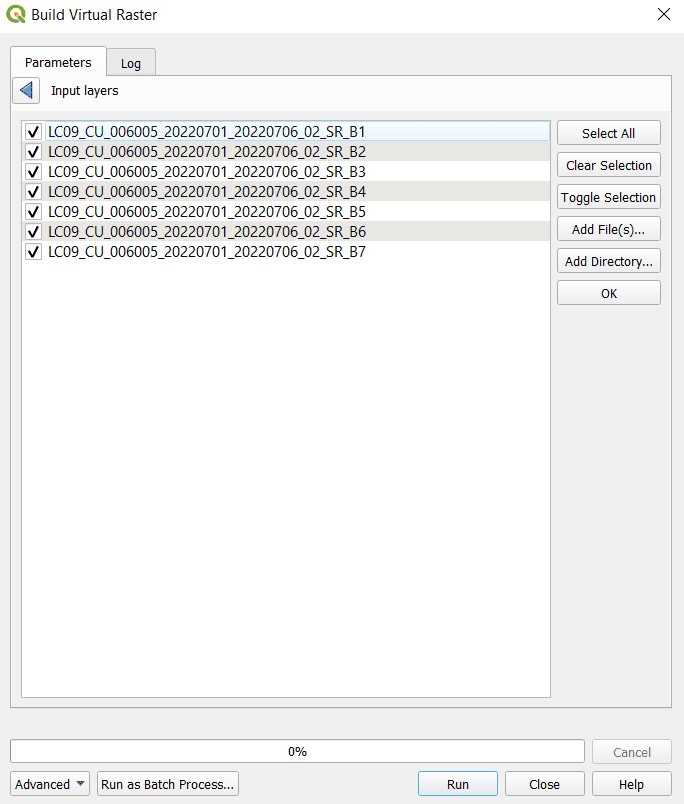
Once the tool window opens click the three dots (. . .) next to Input layers. This will open a new window where you can select the layers you wish to include in the virtual raster. Here, I’ve selected Landsat 9 bands 1-7 (see image below). When you’ve selected the bands to include, click OK.
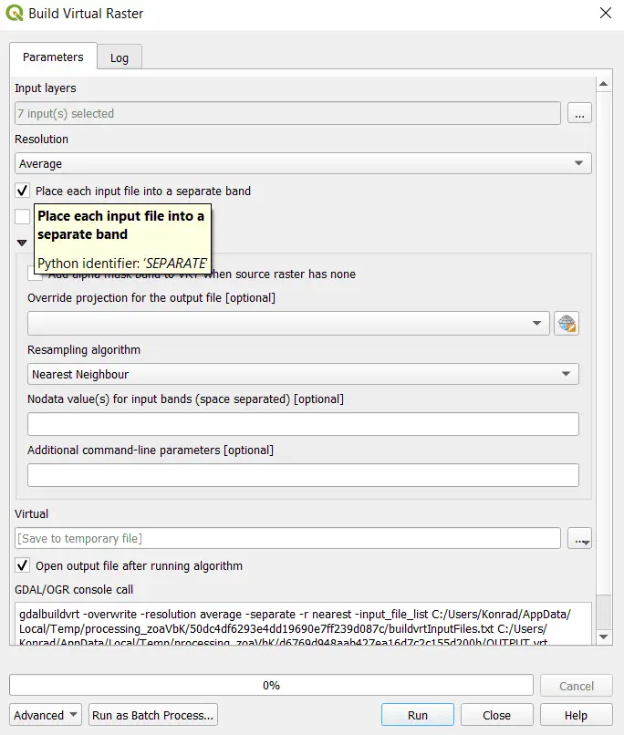
Make sure you check the box to “Place each input file into a separate band”. Otherwise, you will get a raster with a single band where the input bands are averaged together. Your settings should look similar to the image below (these are the settings I used to create the virtual raster). Once your settings for building the virtual raster look correct, click Run to build the virtual raster.
The virtual raster should now appear in your Layers panel.
Display the Virtual Raster as a Color Image
After the virtual layer is created we can adjust the symbology to display the image in true color. I will use the Layer Styling panel to adjust the symbology.
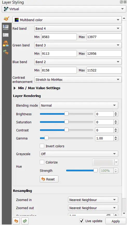
If you have imported Landsat 9 bands exactly as demonstrated above you can display true color by changing the styling method for the virtual raster to Multiband color. Now assign Band 4 to the Red band, Band 3 to the Green band, and Band 2 to the Blue band, as shown in the image below. The key to getting the image to display true color properly is to assign the red, green, and blue bands from the satellite image to the corresponding display band in QGIS. For Landsat 9 the red band is band 4 (B4), green is band 3 (B3), and blue is band 2 (B2).
These band numbers may be different for other satellite (including Landsat) sensors. Additionally, the virtual raster bands are numbered by how they appear in the Input layers list, so make sure your bands are in order when you create the virtual raster to avoid confusion.
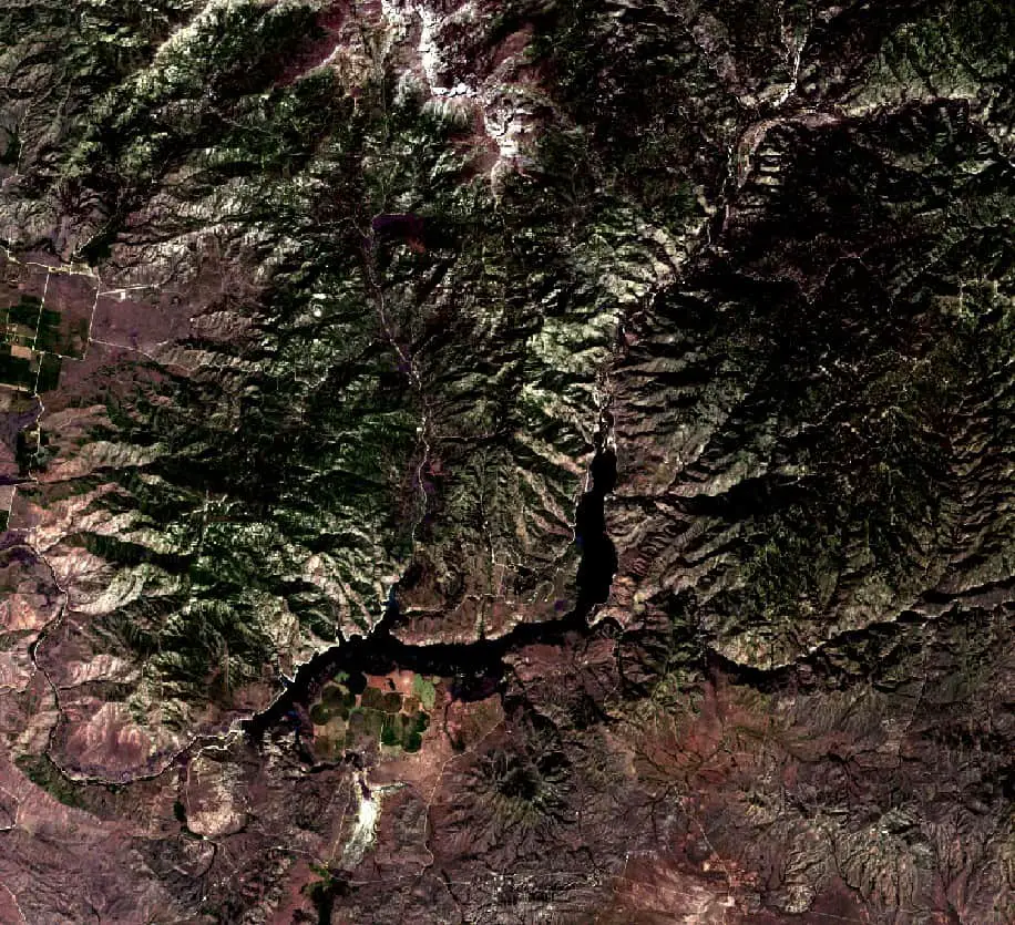
Once you have applied these settings your satellite image should appear in true color. You can see an example of my image below.
Perform K-Means Classification
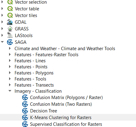
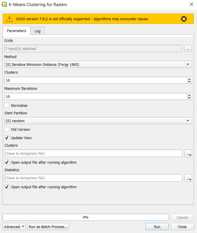
In this example, we’ll be using the K-Means algorithm to perform unsupervised classification. In QGIS the K-Means algorithm for raster classification is available in the SAGA toolset. You can access this tool from the Processing Tools panel under SAGA > Imagery – Classification > K-Means Clustering for Rasters, or by searching for K-Means from the search bar in the lower-left corner of the QGIS interface.
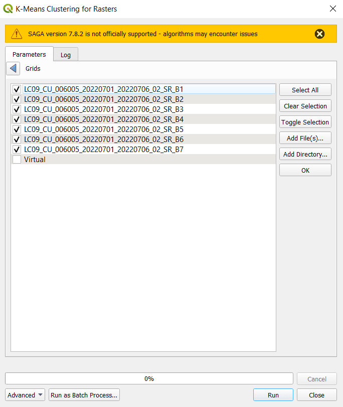
Once you open the K-Means tool, click the three dots (. . .) next to Grids to select the input layers. For this exercise select band numbers 1-7 or 2-7 for Landsat 9 images. Either combination will work well. Make sure you select the actual bands and not the virtual raster (see the image below). Once you’ve selected the appropriate bands, click OK.
Note: I’m not sure how the K-Means classification tool handles rasters with different spatial resolutions. If you’re using additional bands or other layers that have differing resolutions you should check out the documentation for this tool to ensure it is performing in an expected way. Alternatively, you could resample all your input layers to be the same extent and resolution. This is something you’ll want to look into if you’re using Sentinel-2 images because Sentinel-2 bands do not all have the same resolution.
Now we’ll configure additional settings for the K-Means Clustering tool. Notice that I’ve set the method to “[0] Interactive Minimum Distance (Forgy 1965)”. I changed from the default method because I had some problems with it. However, the mentioned method seemed to work as it should
If you’re tuning the classification for a real-world application, you may find that you need to adjust the number of clusters and number of iterations to improve your results. The image below shows how I configured the tool for unsupervised classification.
Once the inputs and settings are configured, click Run. This tool will take a few minutes to run and you may get some error messages. As you can see, QGIS does not officially support the latest version of SAGA, so there may be some problems. I received some error messages, but the classification result was still created.
If you’ve kept the same settings shown here, you should have a new layer named “Clusters” in the QGIS Layers panel when the tool completes running.
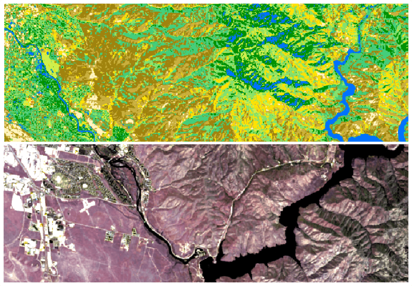
Examine Classification Results
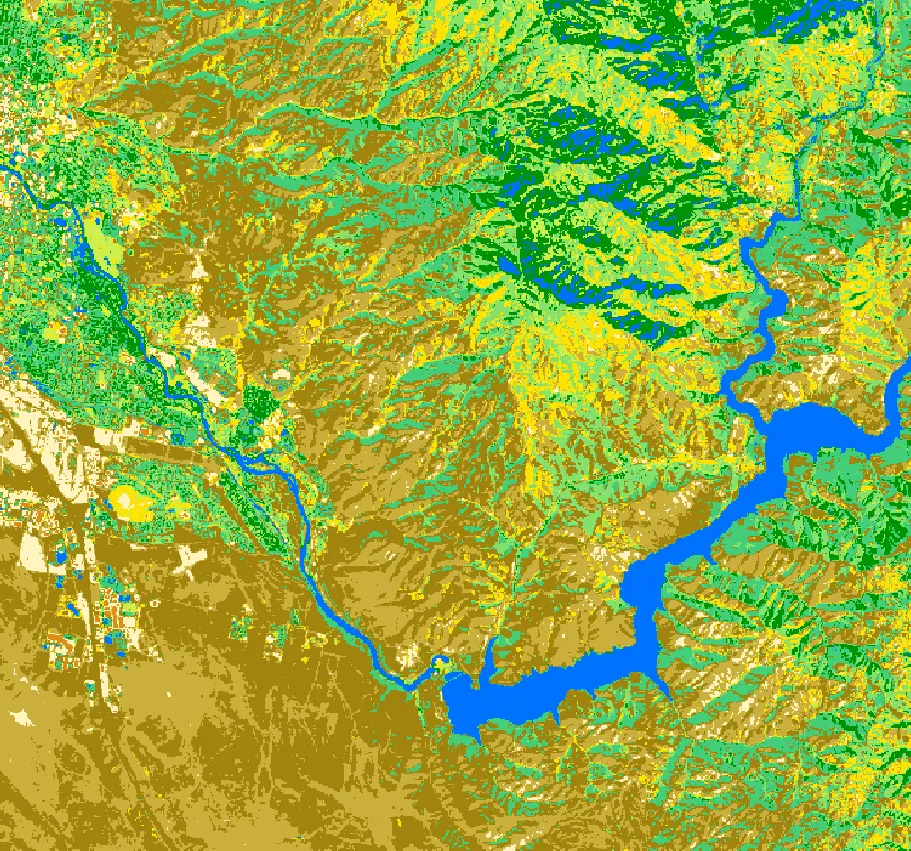
Initially, the classification results will be displayed in grayscale. I suggest changing the symbology (in the Layer Styling panel) to Palletted/Unique Values. Set the color ramp to Random Colors (the default), then click classify. This will give each class a unique color.
I took a little time to examine the classes and change the colors to something that made more sense for each class. Keep in mind that unsupervised classification creates classes strictly on data values. That means there is no real meaning for the classes. For example, you can not expect that all coniferous trees will automatically occur in the same class.
You can see in my image below that water, shadow, and coniferous vegetation are all represented by the blue class and coniferous vegetation is also represented by dark green. Also, there are several classes that represent grasslands and bare ground (browns, tans, and yellows). Overall, the classification did a decent job distinguishing different land cover classes, but I would want to do some tuning if the results were to be used for a real-world application.
Conclusion
This article gives a simple primer on performing unsupervised image classification with QGIS. As you can see, it is relatively easy to perform the unsupervised image classification. As with most analyses, the difficult part lies in tuning and assessing the classification’s accuracy, something we haven’t done here. I hope this tutorial has helped you get started and wish you luck in your GIS endeavors!
Whether you’re looking to take your GIS skills to the next level, or just getting started with GIS, we have a course for you! We’re constantly creating and curating more courses to help you improve your geospatial skills.

All of our courses are taught by industry professionals and include step-by-step video instruction so you don’t get lost in YouTube videos and blog posts, downloadable data so you can reproduce everything the instructor does, and code you can copy so you can avoid repetitive typing