Up next in 10

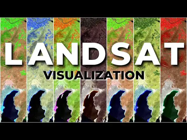
Changing the way you visualize satellite images can provide important contrast and information without conducting formal analysis. This tutorial will demonstrate how to easily create false-color satellite images using Landsat imagery.
Check out my website for more: https://opensourceoptions.com
How to download Landsat images:
Show More Show Less View Video Transcript
0:01
Welcome to open source options. I have
0:04
QGIS open right now with some LANCAT
0:07
imagery. You can see right here I have
0:09
true color pulled up and you can see
0:12
various details with true color. But if
0:14
I turn off this true color and show you
0:16
this uh color infrared image, you see
0:20
the healthy vegetation pops in red and
0:23
water starts to pop in those dark blue
0:26
colors. Today I'm going to show you how
0:29
you can visualize LANCAT satellite
0:32
imagery very easily in QGIS
0:36
uh and show different band combinations
0:38
to get these false color composits that
0:40
can be super useful for display or for
0:43
analysis. So let's go ahead and get
0:45
started. But first make sure you know
0:48
how to download LANCAT data. I showed
0:50
you how to do that in a previous video.
0:53
We're going to be working with those
0:54
downloaded data. The second thing, go
0:57
check out opensource options.com.
1:00
There may not be courses there yet, but
1:02
I am working on the first course that's
1:04
going to be there. All the courses on
1:06
opensource options.com are going to be
1:08
completely free. Okay. Uh that's how
1:12
we're going to do it. Free courses, free
1:13
GIS, remote sensing, and programming
1:15
courses for everyone. The catch, it's
1:17
going to be slow coming out because it's
1:19
just me working on them, but they will
1:20
be quality professional courses. Now,
1:24
into the LANCAT data, I'm just going to
1:27
start a whole new project here to show
1:28
you how to do this from the beginning.
1:31
So, I'm going to go in. I'm going to
1:32
grab some downloaded LANCAT data. I'm in
1:35
my LANCAT data folder here. I'm going to
1:37
come down to uh this lens set image
1:40
right here and I'm going to come in and
1:44
grab bands one through 7. So I'm going
1:46
to push shift and grab bands one through
1:49
7 and add these in to QGIS. Now I showed
1:53
you how to do this in a previous video,
1:55
so go refresh yourself if you've
1:57
forgotten how to do that. Now I'm going
1:59
to come back to layers here. The thing I
2:02
want to do is I want to create a virtual
2:04
raster. Right now, these are all
2:06
separate layers. They're all separate
2:08
images. I want to combine these into one
2:10
multi-layer image, which will make it
2:13
much easier to show these different band
2:16
combinations as we change our display.
2:18
So, to do that, I'm going to go to
2:20
raster, miscellaneous, build virtual
2:23
raster. I'm going to select my inputs. I
2:26
want to select bends 1 through 7. When
2:29
you do this, make sure they are all in
2:30
the correct order. If they are not
2:32
listed in the correct order, then you
2:34
will have a very hard time knowing which
2:36
band number corresponds to which LANCAT
2:40
image or which LANCAT band. Once you
2:42
have this, click okay on the top up
2:44
here.
2:46
Now, you want to make sure you place
2:47
each input file into a separate band. We
2:51
can leave the other defaults. I will
2:53
save this to a uh a file so we can come
2:56
back and access it if we need to. And
2:59
these are this image here uh that starts
3:03
with the 039030.
3:07
Going to open that up and I'm going to
3:09
save this as I'm just going to call it
3:12
as our stacked images VRT.
3:15
And I'm going to click save
3:19
and I'm going to click run. And I'll
3:22
click close. So I zoomed out too far.
3:25
We'll fix that in a sec. Now I'm going
3:27
to remove all these individual bands.
3:30
Remove layers. And I'll remove this
3:32
layer.
3:35
And I'll right click here and select
3:38
zoom to layer. Now you can see we have
3:40
some color.
3:43
Now there's going to be a trick to this.
3:46
This is not true color. We're just
3:48
showing bands one. Band one is red. Band
3:51
two is green. Band three is blue. What
3:54
we need to do is assign the correct band
3:57
to the correct color to get true color.
4:00
So let's show you how we can figure out
4:02
this information. If I go in um
4:06
and I just searched here for LANCAT band
4:09
combinations and these are for Lancet
4:12
the Lancet 8 and 9 OI which is the data
4:16
we are using. So we can see here that
4:18
for true color we can use the band
4:21
combination 432 for LANCAT 89. If you're
4:25
using different LAN set you can see how
4:26
those would look here. The other thing
4:29
you can search for is
4:32
LANCAT band wavelengths.
4:39
And we can come to LANCAT 8 and take a
4:41
look at this
4:45
here if it ever loads. There it goes.
4:47
And if we scroll down, you can see it
4:50
gives us the band names like blue,
4:52
green, red, near infrared, short wave
4:54
infrared. And also the wavelengths uh in
4:58
micrometers here. And so we can use
5:00
these if we don't know uh which band
5:04
goes to blue, green or red, and we find
5:06
another band combination that we want to
5:08
try. All right, let's go back to QGIS.
5:12
Let's go back and look at these. So true
5:14
color is going to be 432. Let's go uh
5:17
visualize that to start.
5:20
So, QGIS, we're going to change red to
5:23
four, green to three, blue to two. And
5:27
there you go. You can see we now have
5:29
that true color image looking as it
5:32
should. All right. Now, let's try to do
5:36
uh a color infrared. Very easy. We just
5:39
change this to five 4 3. And now we have
5:45
color infrared. And you can see how that
5:47
vegetation really stands out. It's that
5:50
bright red. We can see those irrigated
5:52
fields next to the unerrigated uh lands.
5:56
And we can see that water becomes these
5:58
very dark colors uh blues to getting
6:01
into black. And then we can see this
6:03
vegetation here that's not irrigated.
6:05
The natural vegetation uh is a little
6:07
darker red. And if we zoom in on these
6:09
valley bottoms where there's probably
6:10
some riparian water, some water,
6:12
riparian vegetation, we can see they're
6:14
brighter red. So, this can be a very
6:16
useful combination for visualizing
6:19
vegetation. Let's go take a look at some
6:21
of these other combinations combinations
6:24
we might try. We can try Oops. Let me
6:26
reset that. We can try uh this urban
6:29
faults color,
6:33
which is going to be 764. Let's go give
6:35
that one a try. QGIS. So we just come
6:38
and go seven,
6:41
six, four. And this will help us
6:44
identify urban areas. And so if we zoom
6:46
in where it's urban, indeed we can see
6:48
some definition in that urban zone.
6:52
Pretty cool. And let's go take a look.
6:56
Well, before we take a look at that, let
6:57
me explain what is happening. So I
7:00
showed you in the last image or the last
7:02
video where we downloaded the images how
7:04
every band is just a simple grayscale
7:06
image uh by itself is just scaled with a
7:09
single color and we just see that
7:11
variation in that single band. Now what
7:14
we are doing is we're displaying these
7:16
different bands with different colors.
7:17
So in this instant B instance band 7
7:21
which if we go back here to this which
7:25
is our shortwave infrared is being
7:28
displayed in the color red. Instead of
7:31
showing red as red, we're showing the
7:32
shortwave infrared as red. Band six,
7:36
which is also shortwave infrared but at
7:39
a different wavelength is being
7:41
displayed as green. And band four, which
7:43
is red, is being displayed as blue. And
7:47
so we change the values for those
7:49
colors, we get these unique um
7:53
unique color hues describing different
7:56
land cover types. So it's a really cool
7:58
way to visualize our data. All right,
8:01
let's go take a look at another one of
8:02
these color combinations and let's try
8:06
this one for vegetative analysis, uh
8:09
which is going to be 654.
8:12
Let's go back to QGIS. And again, we'll
8:14
just change this to six, this to five,
8:17
and that to four. And here you can see
8:20
we get the vegetation popping out in
8:23
green on some of those unveated or drier
8:26
areas coming out in that pink color.
8:29
This is a really neat way to look at
8:31
things. Again, our water is very dark.
8:33
it absorbs um most of the most of the
8:39
light from band six and five. That's a
8:42
really neat way to to see our
8:44
vegetation. And if you notice the last
8:46
one, we'll take a look at this. We can
8:48
just change that to 754 for our
8:51
shortwave infrared and we're going to
8:53
get a very similar result. But you'll
8:55
notice here, let's look at this one
8:57
particular area. It looks like this may
9:00
have been a forest fire and we can see
9:01
that really pops in that red when we
9:03
change to a different wavelength for a
9:05
shortwave infrared.
9:08
Okay, so you can see how visualizing
9:10
Lancet data with these different band uh
9:13
with with these different band
9:14
combinations and these different false
9:16
color composite images can give you a
9:19
lot of information without conducting a
9:22
formal analysis. All right, everyone.
9:24
Thanks for watching. I hope you found
9:26
this useful. I hope that this helps you
9:28
understand LANCAT imagery a little
9:30
better and helps you make some great
9:32
visualizations. If you have questions or
9:34
suggestions for other videos, leave them
9:36
in the comments below. Again, thanks for
9:38
watching and have a wonderful day.
#Earth Sciences
#Ecology & Environment