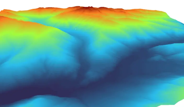
How to Make Custom Color Ramps with QGIS
Have you ever run into the problem where default symbology options aren’t enough and you need to create a custom color ramp? If so, you are not alone. I’m pretty picky about my visuals. Everything has to be just right. A big part of that is making sure color ramps are fit for both purpose and theme.
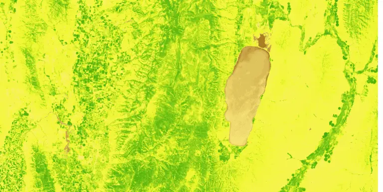
Color ramps are the key to effective visualization for continuous data. While software like QGIS, ArcGIS, others ship with a substantial number of default color ramps, it’s a normal occurrence that you need something a little custom. Sometimes those color ramps clash with other data symbology. Other times the colors may not match the feature you are showing. Most recently, I wanted to display NDVI with a brown, yellow, and green palette that wasn’t present with a custom color ramp.
To create a new QGIS color ramp, or edit an existing one, go to the symbology tab. Then change the render type to ‘Singleband pseudocolor’. To create a new color ramp, right-click on the displayed color ramp and select ‘Create New Color Ramp’. To edit the current color ramp, left-click on the displayed color ramp and make your edits.
Follow along below for a detailed example of creating a custom elevation color ramp to symbolize a digital elevation model. You can also watch the video at the end of the article for a visual demonstration.
Add Raster Data to QGIS
To follow along with this tutorial, you will want to have your own raster data. For this example, I’m using a digital elevation model (DEM) of the Logan River watershed in northern Utah.
Add your data to QGIS. Unless you’ve changed the default QGIS settings your raster will automatically be symbolized in grayscale (black and white).
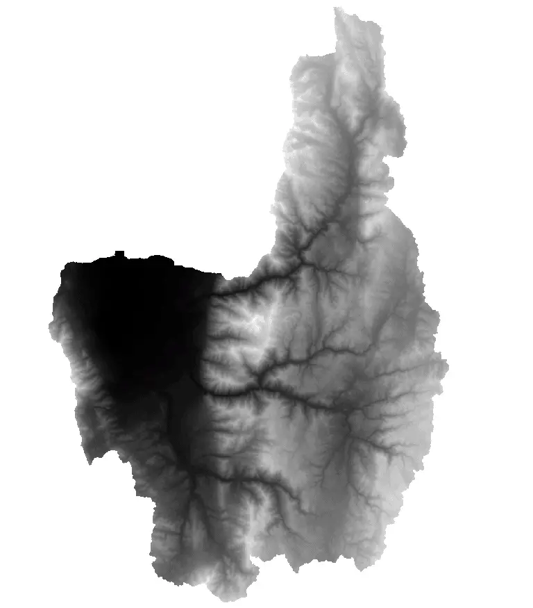
If you don’t already have a DEM or other raster handy, you can download one for free from the USGS. The video below gives step-by-step instructions for downloading a DEM anywhere in the United States. Once you have some data to use you’re ready to begin creating custom symbology.
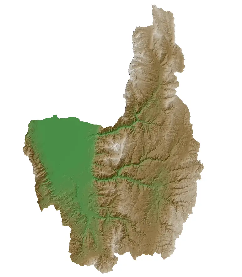
DEMs look much better when they are slightly transparent with a hillshade underneath. If my graphics look a little different than yours it’s because I’m displaying a hillshade underneath my DEM for added effect. You can learn more about making professional maps with QGIS from my in-depth course.
Set the Raster Render Type
The first step to create a color ramp is to set the layer symoblogy so that it can be rendered in color. Right-click on your raster layer in the QGIS table of contents (A.K.A the ‘Layers’ panel) and select ‘Properties’ (you can also double-click the layer). Now select the symbology tab on the left side of the window that opens.
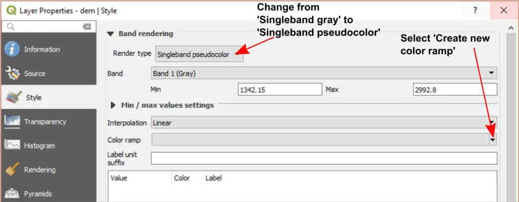
Once the symoblogy options are open change the ‘Render type’ (in the ‘Band rendering’ section of the symobology window) from ‘Singleband gray’ to ‘Singleband pseudocolor’ (see the image below). Now, if you select a color ramp and click ‘Apply’, your raster will appear in color instead of black and white.
Create a Custom QGIS Color Ramp
Create a New Color Ramp
To create a new color ramp click on the drop-down next to the color ramp graphic (see image below). Select ‘Create new color ramp’. You can also right-click on the color ramp graphic area and select ‘Create New Color Ramp’ from that menu.
To edit an existing color ramp you can click on the color ramp graphic, or select ‘Edit Color Ramp’ after clicking the down-arrow to the right of the graphic. Don’t edit an existing color ramp yet, we’re going to create a brand new one.
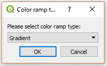
Now an option will appear to select the type of color ramp you want to create. For this example, we’ll create a gradient color ramp. You can experiment with the other options if you would like.
Set the Color Ramp Gradient Stops
After you have selected the color ramp type the ‘Select Color Ramp’ window will open (see image below). This is where you can set the properties and adjust the colors for your new color ramp.
I really like the color combination of green, brown, and white to display elevation. This color ramp does not come with QGIS, but we’ll create it here.
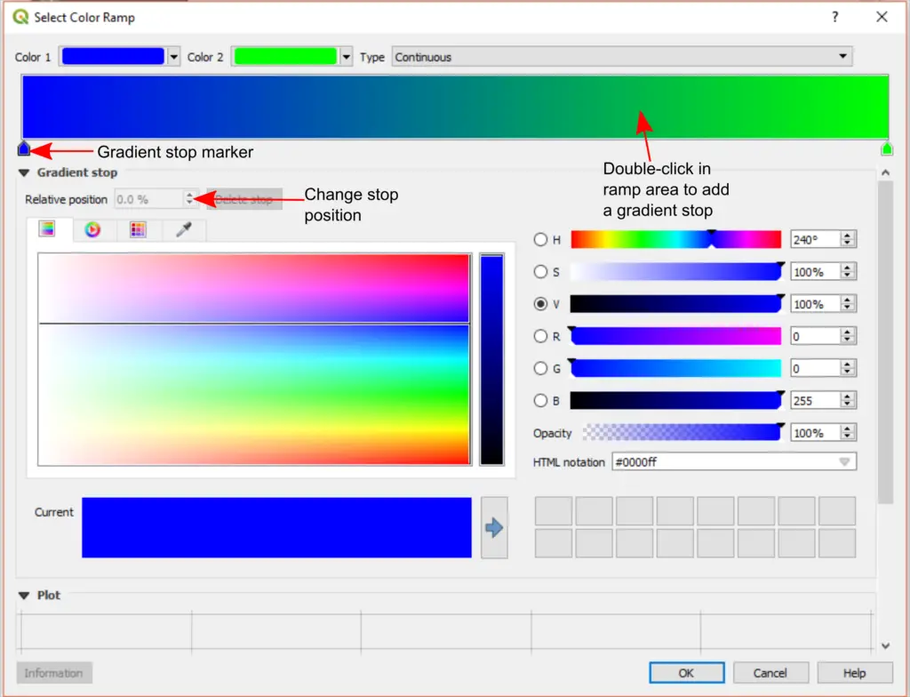
Gradient stops specify which colors are represented at specific locations on the color ramp. The position is specified as a percentage where 0% is the far left side of the ramp (low values) and 100% is the far right side of the ramp (high values).
If you have created a brand new color ramp it will have two gradient stops to begin. One at 0% and one at 100%. You can change the color of a gradient stop by clicking the colored marker below the gradient symbol (see image above). This will select a gradient stop. Then adjust the color with the controls in the window.
To add a new gradient stop double-click in gradient/ramp area at the desired location.
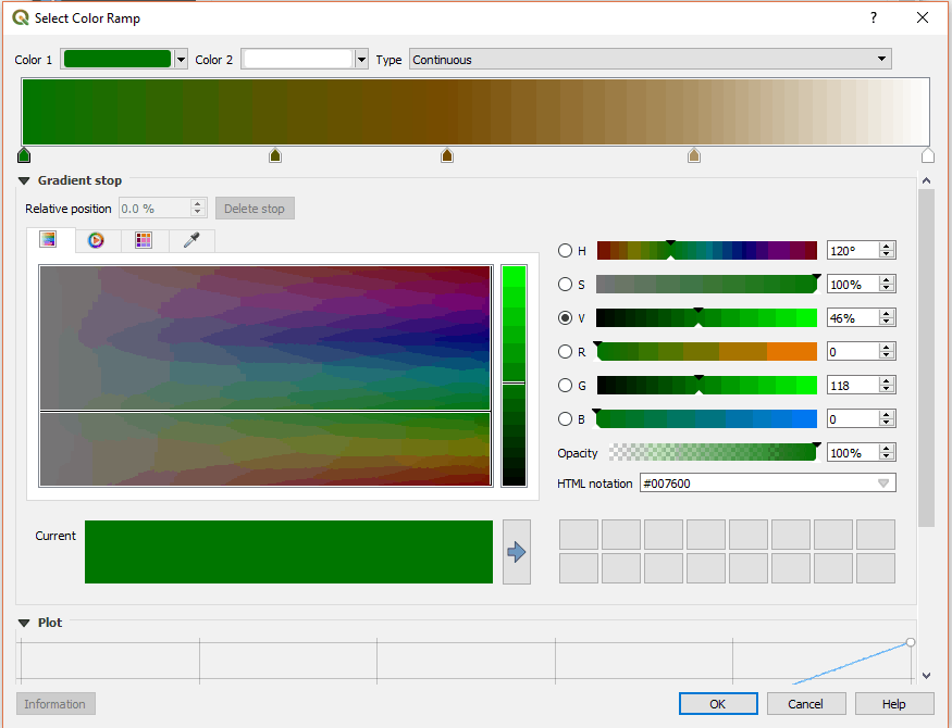
Below is the image of the gradient I’ve created to represent elevation. The gradient stop positions and RGB (red, green, blue) color values are also listed so you can replicate the ramp.
- Position: 00.0% RGB: 0, 120, 0
- Position: 28.0% RGB: 89, 86, 0
- Position: 47.0% RGB: 119, 75, 0
- Position: 60.0% RGB: 146, 110, 49
- Position: 74.0% RGB: 173, 146, 101
- Position: 100% RBG: 255, 255, 255
Save the Color Ramp
Once you have your color ramp looking the way you like click ‘OK’ to return to the main symbology window.
Now save your new color ramp so you can use it again in the future. To do this click the drop-down arrow next to the color ramp graphic. Select ‘Save Color Ramp’. Type in a descriptive name and add some tags so that you can easily find your color ramp in the future. The new color ramp will automatically be added to the color ramp catalog for the machine it was created on. If you want to use it on another machine you’ll need to import your settings to the new machine or create the color ramp again.
Display the Color Ramp on a Raster
Once you click ‘OK’ or ‘Apply’ in the layer symbology window your new color ramp will be applied to raster.
To symbolize a different raster with your new color ramp, simply add the raster to QGIS, open the symbology window, and select your custom color ramp from the list of available color ramps.
Conclusion
Custom color ramps are a great way to improve your data visualization. A custom ramp can quickly take your map from ‘default’ and ‘basic’ to something truly spectacular. QGIS makes custom color ramps so easy to create that after you do it once you’ll soon find yourself making a new color ramp for each type of data you commonly display.
