How to Make a False-Color Satellite Image in QGIS
False-color satellite images can be very useful to visually analyze different landscape characteristics. They also look really cool and are used to make very artistic maps and displays.
False-color satellite images are created by displaying different band combinations with different colors. For example, a color near-infrared image is created by displaying data from the near-infrared sensor as red, data from the red sensor as green, and data from the green sensor as blue.
Color near-infrared is commonly used to show areas that are vegetated and areas that are covered by water (see image below). Vegetation reflects near-infrared (NIR) light and water absorbs both NIR and red light. This band and color combination results in healthy green vegetation appearing bright red in the image water-covered areas appearing nearly black.
In QGIS false-color composite images are created from satellite imagery by changing which image band is displayed by red, green, and blue light. These changes are made by setting the layer’s symbology to multiband color and changing the default band display settings.
This tutorial will demonstrate how to create a false-color composite image in QGIS using Landsat 8 satellite imagery. The same steps can be applied to create a false-color composite using any multi-band imagery. Visual learners can watch the demonstration by video.
Create a Multiband Raster Layer
If your imagery is already in a multiband format you can move on to the next section. Otherwise, follow these steps.
Determine the Number of Bands in a Raster Layer
To check the number of bands in your image, add it to QGIS and go to the layer properties. Select the Information tab on the left. This tab will probably contain statistics for each band. Scroll down until you see the Dimensions information. You will see the number of rows, columns, and bands in the raster layer.
Add Landsat Bands to QGIS
For this tutorial, I’ll be using Landsat 8 Analysis Ready Data. The video below demonstrates how you can obtain these data free of charge.
Each Landsat band will be represented by a single raster file (.tif). Bands 1-7 (really 2-7) are what we are most interested in. The description of the bands is listed below. More information about Landsat 8 instrumentation can be obtained from the USGS.
- Band 1 Coastal Aeresol (0.43 – 0.45 µm) 30 m
- Band 2 Blue (0.450 – 0.51 µm) 30 m
- Band 3 Green (0.53 – 0.59 µm) 30 m
- Band 4 Red (0.64 – 0.67 µm) 30 m
- Band 5 Near-Infrared (0.85 – 0.88 µm) 30 m
- Band 6 Short-Wave Infrared (SWIR) 1(1.57 – 1.65 µm) 30 m
- Band 7 SWIR 2 (2.11 – 2.29 µm) 30 m
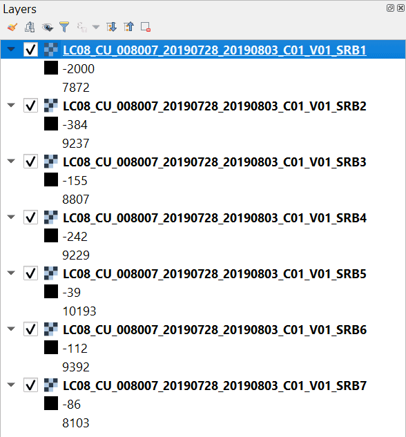
Add the Landsat 8 bands 1-7 to QGIS. Make sure the bands appear in numerical order in the table of contents. This is important to ensure each band corresponds to the correct layer of the multiband raster. Once added your table of contents should look similar to the image below.
Merge Multiple Bands to a Single Raster
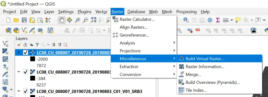
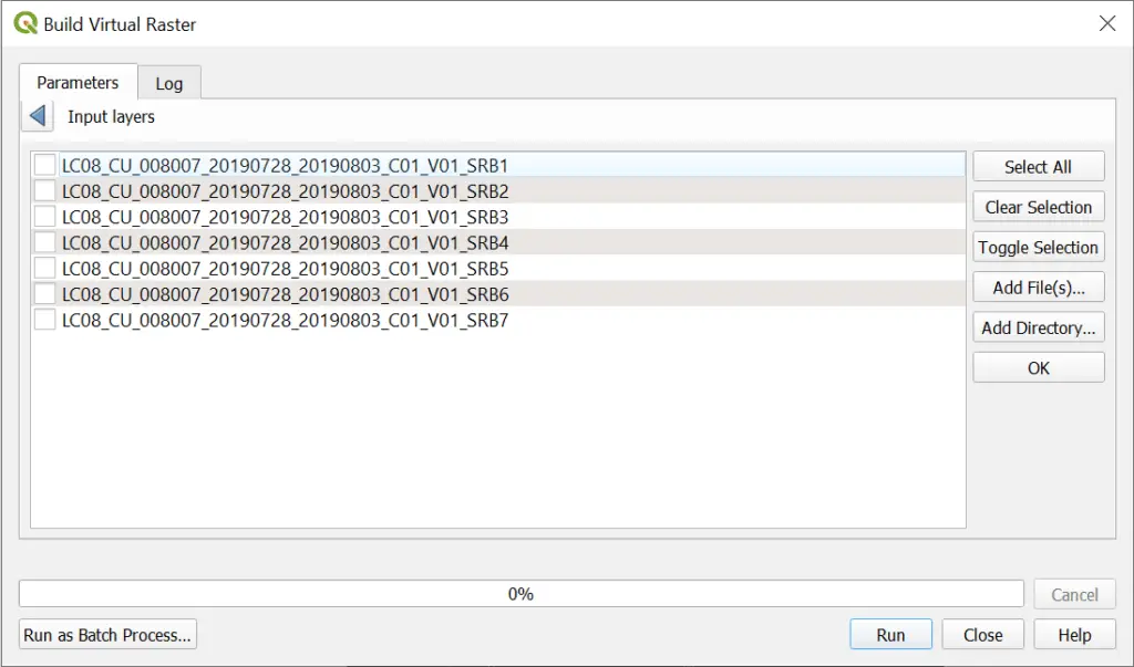
Now it’s time to merge all of the Landsat bands into a single, multiband raster. To do this, enter the ‘Raster’ drop down on the QGIS Main Menu. Expand ‘Miscellaneous’ and select ‘Build Virtual Raster’ (see image below).
In the Build Virtual Raster window that appears, you will notice a message under Input Layers that says “0 inputs selected”. Click the ellipsis (three dots . . .) next to Input Layers. This will open a new window that displays all of the raster bands that are currently loaded into the QGIS project. Select all 7 of the Landsat 8 bands (these should be the only 7 layers in your project). You can use the ‘Select All’ button. Then click ‘OK’.
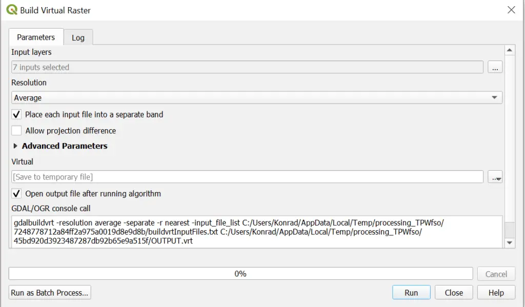
The last step is to specify the output file. You may also leave the default to create a temporary layer. If you do this the temporary layer will not be available after you close QGIS. Once you have specified the output file click Run. When Build Virtual Raster has finished running a new layer will be added to the QGIS Table of Contents.
Create a True Color Satellite Image
After your multiband raster is created and added to the QGIS interface you will notice that it is probably displayed with some strange colors. Let’s start by creating a true color image to learn the basics of displaying and symbolizing multi-band imagery.
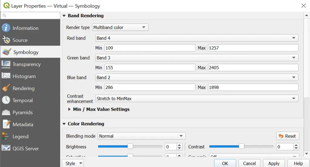
Open the properties for your multiband raster and go to the symbology tab. The ‘Render type’ should be ‘Multiband color’. If it is not change it to ‘Multiband color’ from the ‘Render type’ drop-down menu.
The multiband color renderer displays options for adjusting the red, green, and blue bands. By default red, green, and blue bands will probably be set to bands 1, 2, and 3, respectively. However, the Landsat bands that correspond to red, green, and blue are band 5, band 4, and band 3. Use the drop-down menu to assign the proper bands to the proper colors.
Display the Landsat 8 image in true color with these band assignments:
- Red band: Landsat 8 band 4
- Green band: Landsat 8 band 3
- Blue band: Landsat 8 band 2
You symbology window should like the image below. Once it does click okay and the multiband image will displayed in true color.
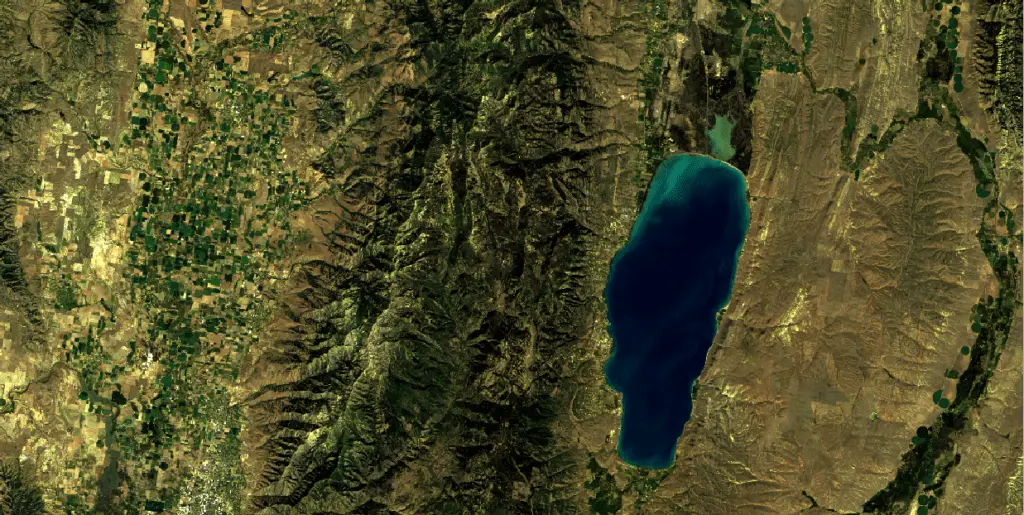
Here’s a portion of the true color Landsat 8 image displayed.
False-Color Satellite Image with QGIS
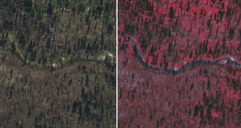
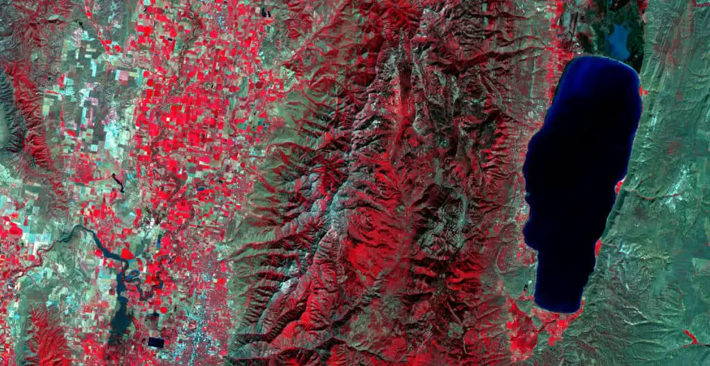
Color Near-Infrared
As mentioned earlier in this article, a color near-infrared image displays green, healthy vegetation in red. This image is easy to create with the Landsat data we are using. We simply need to reassign which bands are shown in red, green, and blue. In the QGIS symbology tab change the band assignments to the following to create the color near-infrared image.
Color near-infrared false-color band combinations
- Red band: Landsat 8 band 5
- Green band: Landsat 8 band 4
- Blue band: Landsat 8 band 3
You’ll get an image with similar coloration to the one below. You can see that vegetation in the mountains and agricultural fields is bright red and the lake is almost black.
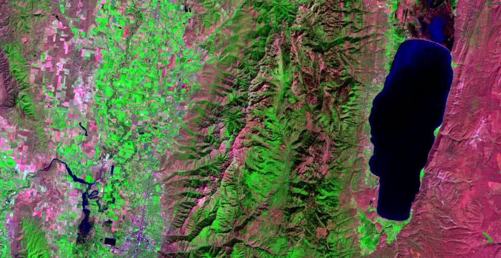
Another Landsat 8 Band Combination
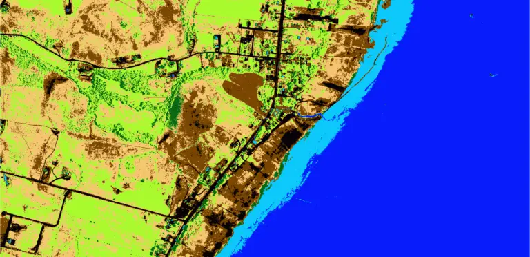
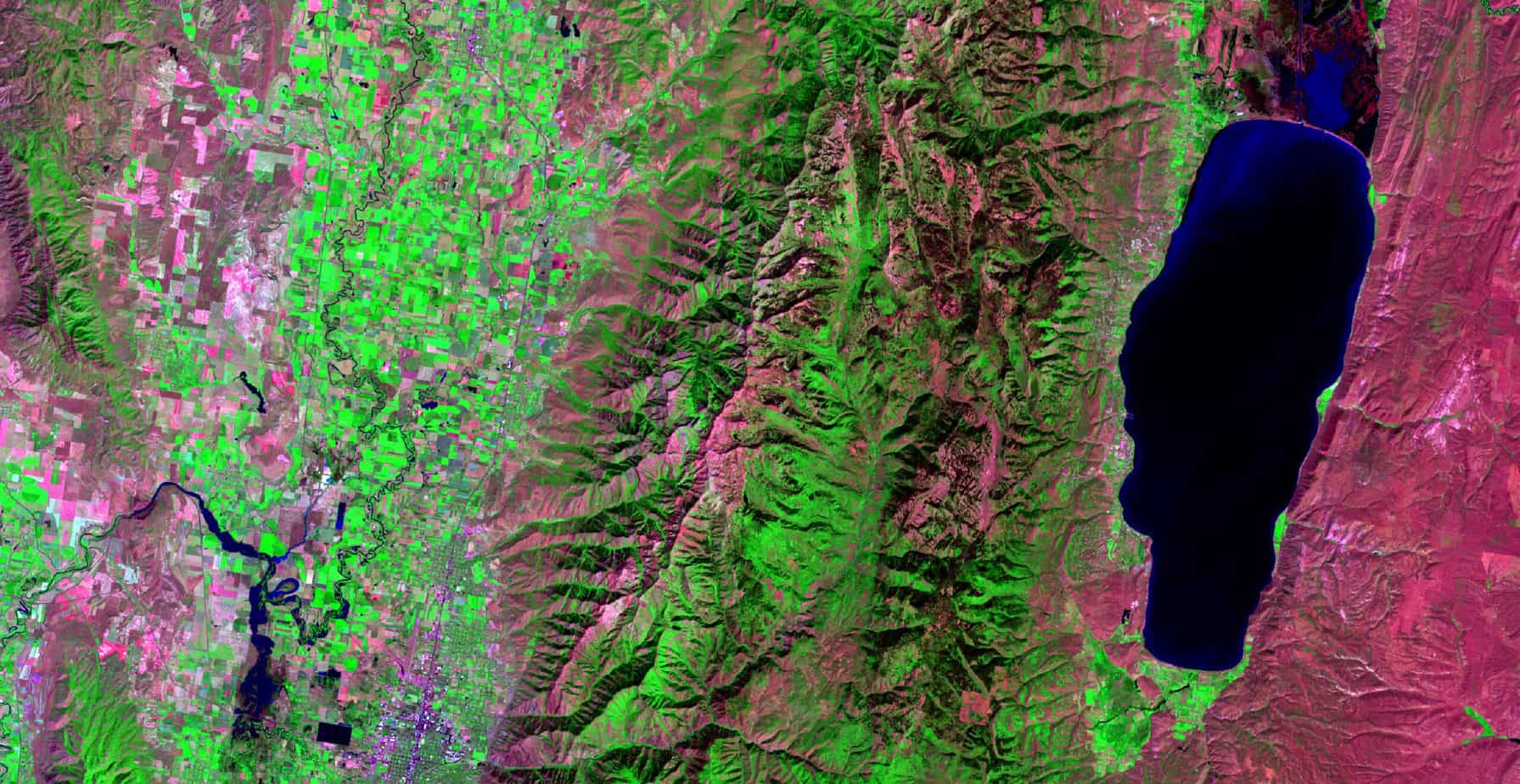
This next combination will display green vegetation as bright green. If you think we can do that simply by assigning the NIR band to be displayed as green, you are correct! We’ll assign SWIR to the red band and green to the blue band.
- Red band: Landsat 8 band 7
- Green band: Landsat 8 band 5
- Blue band: Landsat 8 band 3
This band combination can help us visualize vegetation, land, snow, and water. In the image below you will notice that, once again, water is almost black, vegetation is green, and bare ground is pink/purple. There isn’t any snow in this image, but it would appear bright blue (almost cyan) if it were present. This band combination is often referred to as ‘natural with atmospheric removal’.
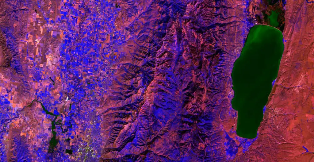
Make Your Own Color Combination
Feel free to experiment with band combinations. You will find some that look similar to those mentioned here. You will find some that look really ugly, and some that look strange. I’ve given an interesting example below. It doesn’t necessarily have a specific function, but it does present some interesting colors for different features.
Conclusion
Understanding the characteristics of how visible light represents different land surfaces is fundamental to remote sensing. Working with multiband imagery and generating false-color composite images can help you understand the interaction between an image’s different bands. Having the skill to make these images will also improve your data visualization and help you effectively display pertinent information.